Conclusion and Background
In this Plan Management Navigator, we examine the potential for returns associated with Risk Adjustment for Medicare Advantage. Our analyses revealed several statistically significant relationships. Notably, higher Risk Adjustment expenses were correlated with higher Medicare Premiums (on a wage adjusted basis), higher Medicare health benefit costs (on a wage adjusted basis) and a greater Number of Chart Reviews. We also observed a significant link between the Number of Chart Reviews and Medicare Dollar Reimbursement Yield (defined as the difference in reimbursement levels after chart reviews compared to the same chart before review).
The Sherlock Benchmarks define risk adjustment expenses as those stemming from the analysis of clinical data in order to match government compensation with the risk factors of members. This includes adjustment for the "three Rs": permanent risk adjustment, transitional reinsurance and transitional risk corridors. Among the activities are chart reviews for risk adjustment, assignment of Hierarchical Condition Categories (HCC) to Medicare Advantage (MA) members and Risk Adjustment Audit expenses to verify that the diagnosis codes submitted to support payment by an MA organization are supported by medical record documentation for enrollees.
The data used for this analysis is the 2024 edition of the Sherlock Benchmarks, which reflects health plan results from the year ended 2023. The Sherlock Benchmarks segments administrative costs into nearly 70 functional or sub-functional areas, along with up to 12 products. This enables the identification and measurement of costs for Risk Adjustment exclusively for Medicare Advantage.
Twenty-four plans provided cost information on Medicare Advantage Risk Adjustment costs. (This excludes one outlier plan). Fourteen of these plans supplied volumes of chart reviews, and thirteen provided Medicare dollar reimbursement yield metrics.
For this analysis, we consider relationships to be significant with P-Values of 10% or less. P-Value measures the chance that the regression line could be the result of unrepresentative data. This is a generous threshold. The R², or coefficient of determination, describes the degree to which all the data points are found on the slope. It measures the degree to which the regression line explains differences between the various values.
Results of the Risk Adjustment Analysis
Figure 1 illustrates a positive relationship between Medicare Risk Adjustment expenses PMPM and Medicare Premiums PMPM on a Wage Adjusted Basis. (The wage adjustment endeavors to reduce the cost of living effect of geographic differences by dividing each plan's premium PMPM by its relative hospital wage index. The relative hospital wage index is the CMS hospital wage index for each plan's headquarters city divided by that of the set of plans.) The analysis yielded a statistically significant relationship with a P-Value of 7.1% and R² of 14.0%. This positive slope indicates that the higher the Risk Adjustment expenses, the higher the wage-adjusted Premiums PMPM.
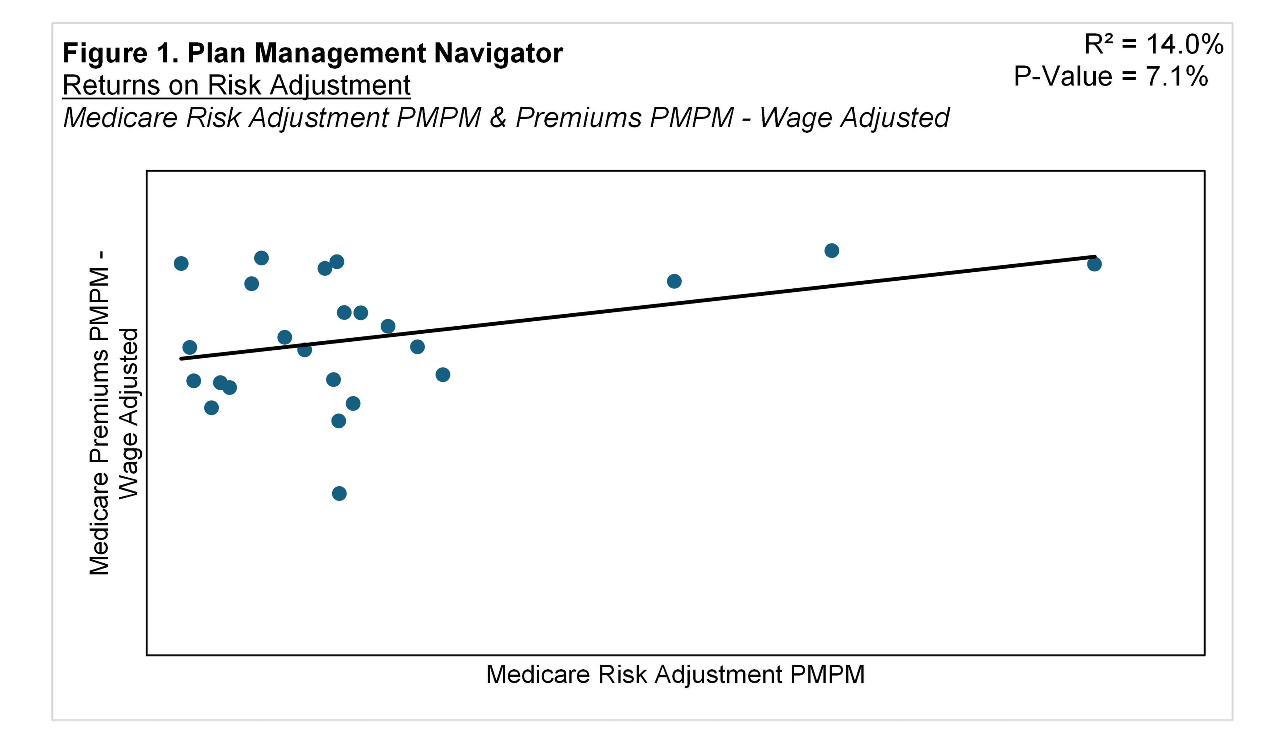
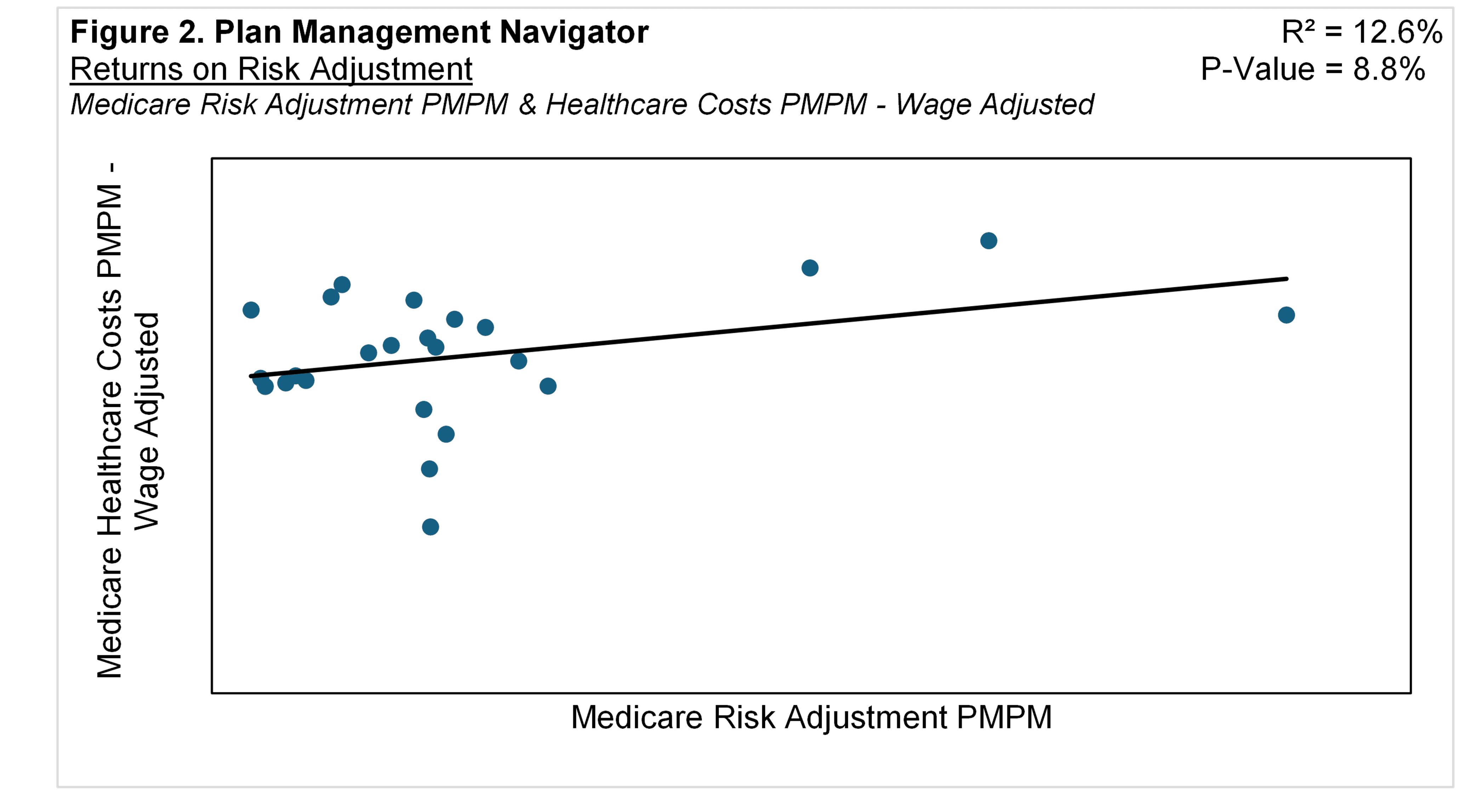
Figure 2 displays a similar relationship, between Medicare Risk Adjustment expenses and Medicare Health Care Costs after adjusted for cost of living. The analysis shows a P-Value of 8.8% and R² of 12.6%. This positive relationship suggests that higher Risk Adjustment expenses are associated with higher health care costs for each member. In other words, risk adjustment activities are more intensive when medical expenses are higher, comporting with the purpose of risk adjustment.
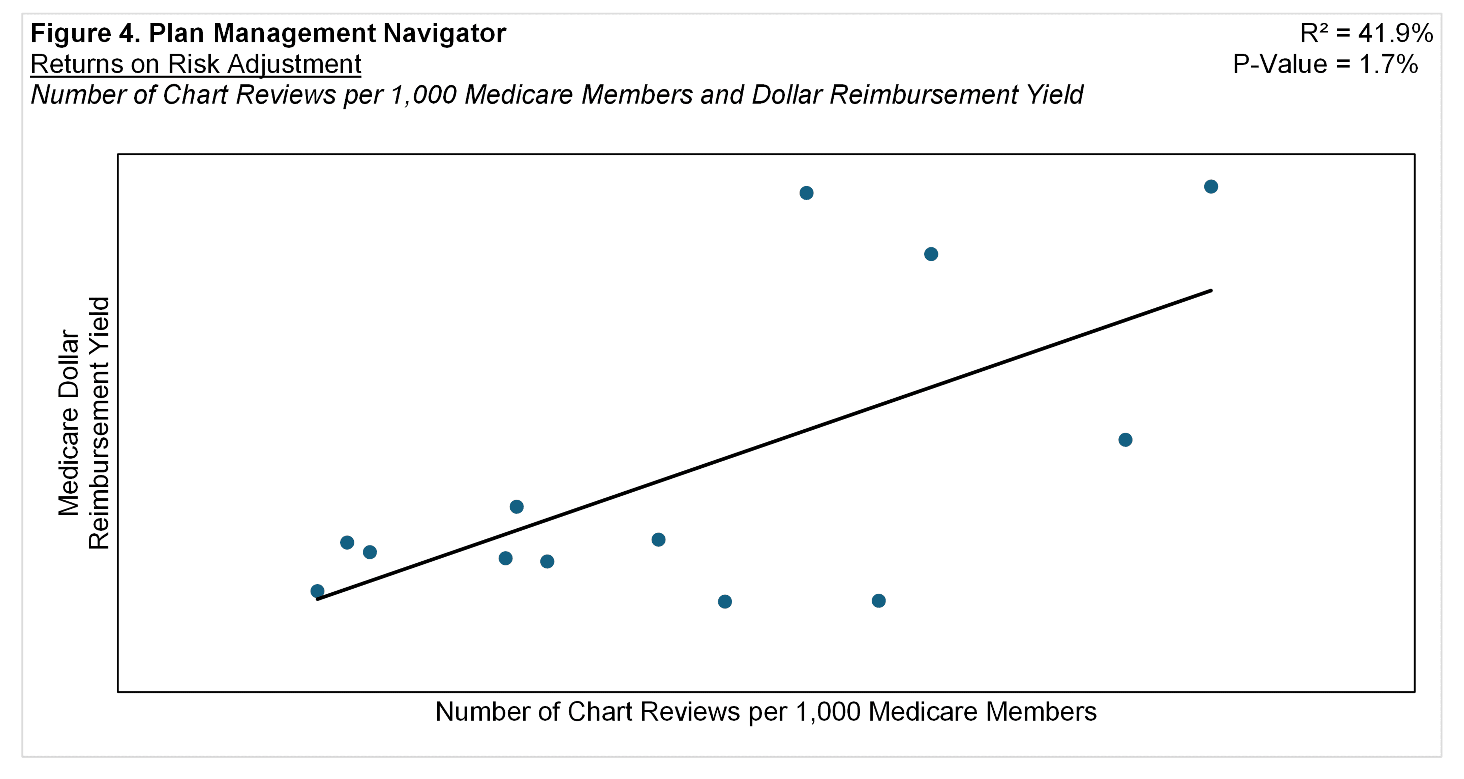
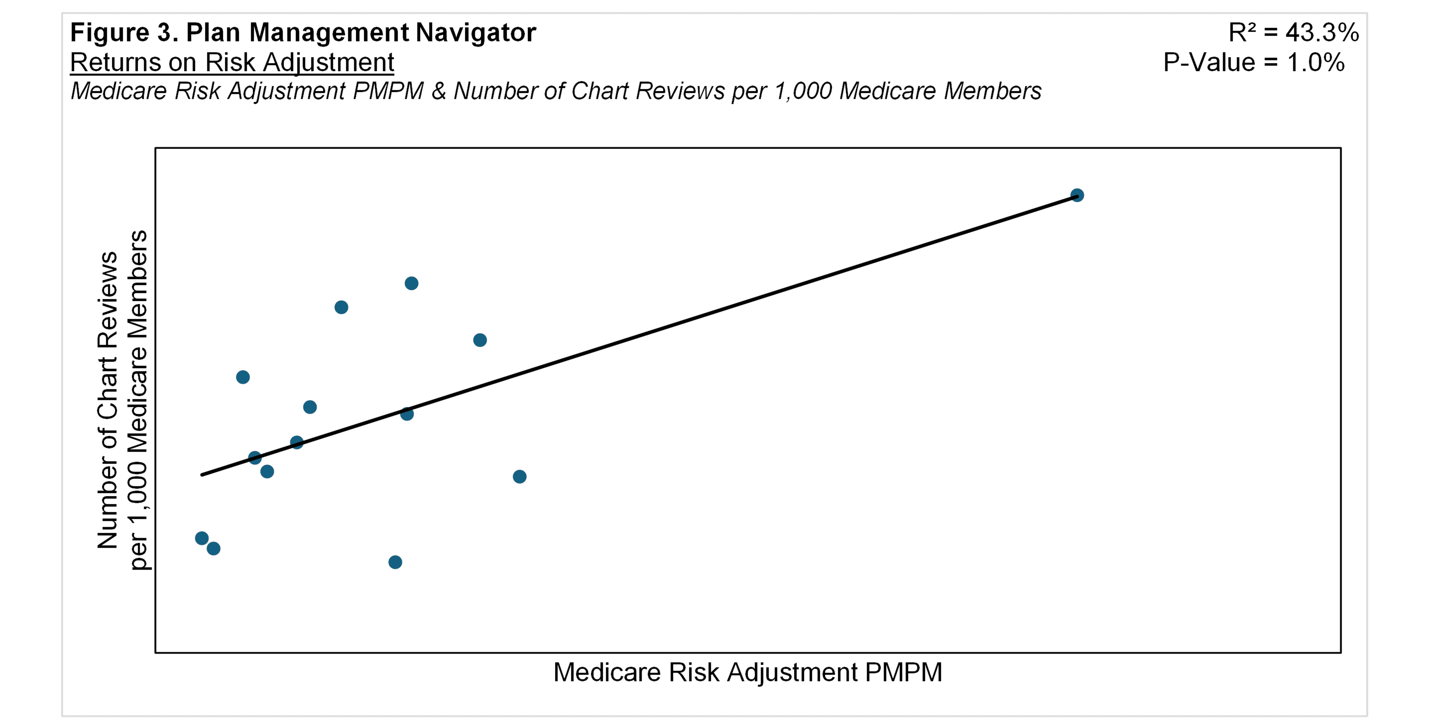
Expenses for risk adjustment correspond with their underlying activities. Figure 3 shows the positive relationship between Medicare Risk Adjustment PMPM expenses and the Number of Chart Reviews per 1,000 Medicare members. The positive correlation suggests that higher Risk Adjustment expenses is related to a greater number of Chart Reviews. The relationship yielded a P-Value of 1.0% and R² of 43.3%.
Chart reviews entail auditing provider documentation and notes to establish accurate coding, in this context used for inclusion in calculating each enrollee's risk score. A "chart" is defined as a medical record pertaining to one member for one provider / location per year. "Location", as used here, entails a common EMR (Electronic Medical Record) system.
Sherlock Benchmarks reporting plans can include in their surveys the amount of additional premium they receive if chart review results in a higher risk score. This is called the Medicare Dollar Reimbursement Yield. Shown in Figure 4, there was a positive correlation between Medicare Dollar Reimbursement Yield and the Number of Chart Reviews per 1,000 Medicare Members. The R² for this relationship was 41.9%, with a P-Value of 1.7%. The findings suggest that, as the per member volume of Chart Reviews for Medicare increases, so does the per member Dollar Reimbursement Yield.